

Case Study
hiJobs!
hiJobs! is non-profit platform offering guidance and help to university graduates who want to get their first job and enter the job market. The goal is for users to improve their skills related to their studies through courses they can follow either on hiJobs! website or on the dedicated mobile app. Each user also gets a mentor to ask questions and practice job interviews, alongside tips to improve their CV and their skills. My role as a UX/UI designer was to listen to their users and create a mobile app and a responsive website aligned with good UX practices.
Some of these features were added after conducting a user research and profiling their target audience and their needs to enter the job market. The participants on the user research study shared their frustrations with the current competitors, which were later identified through a competitive research.

Meet hiJobs!
|
Meet hiJobs! |
Some of the issues identified on its direct competitors were:
More focus on businesses than candidates
Most of the platforms offering a similar product were job posting directories which focused more on the companies than the candidates
Navigation issues
As most competitors are vacancies directories, their navigation felt overwhelming and crowded, with little consideration of the user’s experience while navigating the website
Lack of personal touch
Competitors sites felt really cold and impersonal, not offering real guidance from professionals to land a job in this saturated job market, especially for young graduates
Expensive courses
The competitors that offered courses and tips to improve users’ skills were quite expensive considering they were targeting unemployed people
Step 1: Brand Design
|
Step 1: Brand Design |
hiJobs! was meant to live in the digital world, so its branding had to be consistent with the user experience on their mobile app and website. It was decided to use a clean and professional color palette in different and contrasting shades of blue to be adaptable later on into buttons, cards, shading, headings, text boxes and icons.
The typography was chosen to be friendly but also professional, as the target audience were young graduates looking for their first job. Its logo included the typeface Nunito Sans, its color palette and was made into a logo suite with an icon to use on their mobile app.
Some of hiJobs! visual elements are used in this case study page.
Step 2: Wireframes
|
Step 2: Wireframes |
As hiJobs! was meant to be both a responsive website and a dedicated mobile app, I started designing what is called progressive enhancement or bottom-up designing: from the smallest screen to the largest or phone to computer screens.
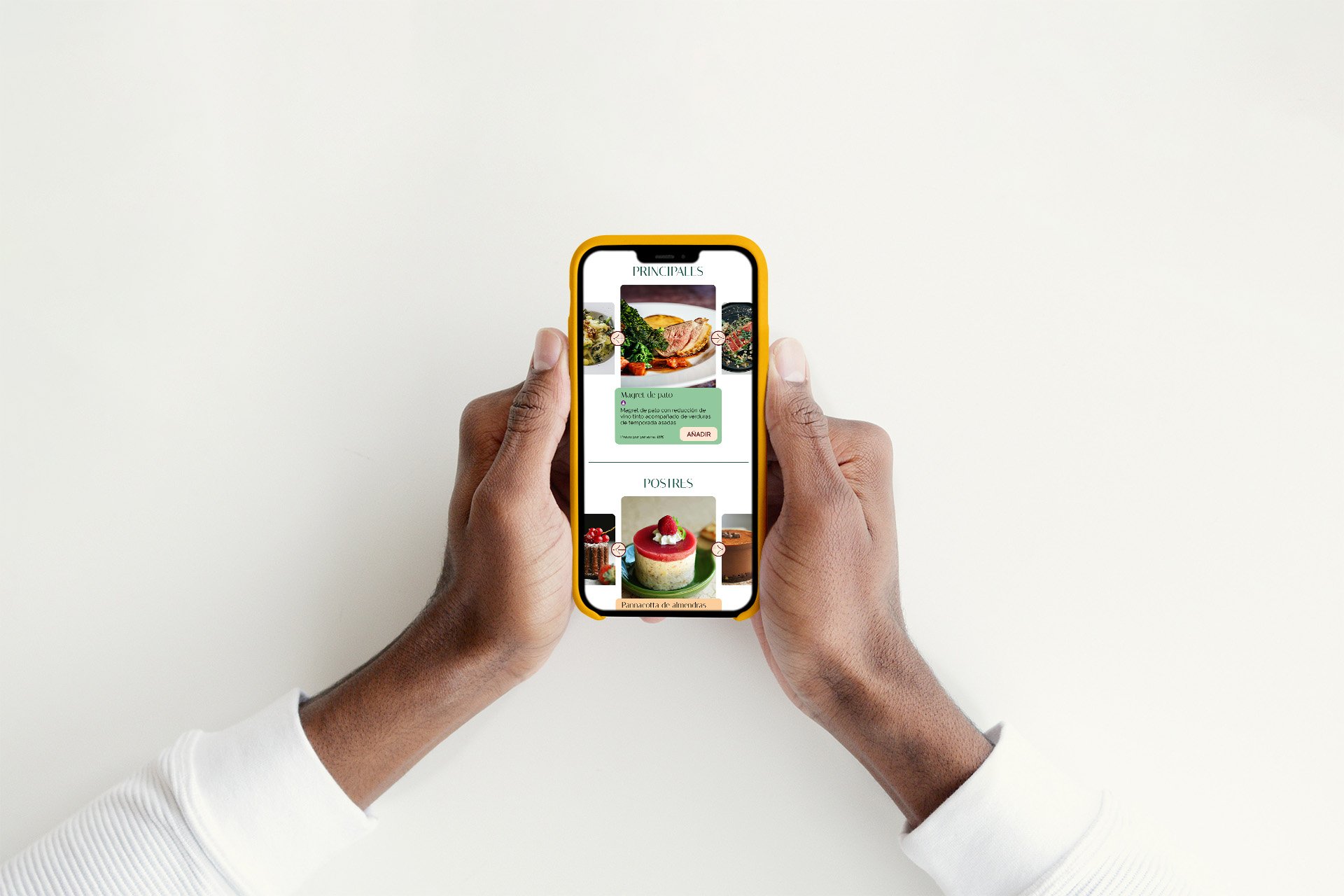
The mobile app had some different functions compared to the website, as it was meant to be an easier way for users to access their courses, mentors and tutorials from anywhere. The wireframes were designed digitally using Figma and included the login page, a questionnaire to know the user, profile page, course page and a course confirmation screen.

Wireframes before usability study
The wireframes were then transformed into a lo-fi prototype to see how the different pages interacted with each other so they could be shared with participants in a usability study.
The challenges this lo-fi prototype was trying to overcome were:
1| The questionnaire was useful to ensure the user’s personalized experience
2| All relevant information about the user and its activity within the app was on their profile page
3| The course page was well structured and including everything the user needed
4| The confirmation page had access to other sections and allowed users to start the course

Updated wireframes after usability study
Step 3: Usability study
|
Step 3: Usability study |
With the mobile app wireframes ready to share as a lo-fi prototype, we conducted a usability study with one task in mind and the following user flow:
Create an account
Answer a questionnaire for a personalized experience
Click on a course
Enroll on a course
Go back to the user profile
After the participants completed the task, we interviewed them to learn more about their experience with the app and improvements to be implemented on the next stage. Using an affinity diagram, the following findings were taken into consideration and applied:
Top navigation bar
Participants pointed out that the top navigation bar was not visible on all devices. Some of them suggested to use only the bottom navigation bar including the elements from the top one such as the profile icon
Other users’ opinions
Most participants loved that there was a dedicated section with other users’ opinions regarding the course to make the decision to participate easier. However, some wanted to see some kind of point system like stars to make the opinions more visible and relatable
More information on course page
Some participants wanted to have more information on the course’s page, such as duration and requirements to be able to make a decision


Step 4: Hi-Fi prototype
|
Step 4: Hi-Fi prototype |
Thanks to the insights gathered through the usability study and the useful feedback from participants, the wireframes were ready to be updated and transformed into hi-fi prototypes with hiJobs! branding. Once the dedicated mobile app was completed, it was time to move onto the website, transforming the app elements into a familiar site from a smartphone screen to a desktop.
It was crucial to design the homepage first as it is an element that differs from a website to a mobile app. A homepage needs to be informative about the platform and take into consideration not only the user but how the product is presented so more people can benefit from it. Using a sitemap to structure the website, the homepage was designed from smartphone to tablet to desktop, ensuring all elements were legible and interacted with each other according to each screen’s characteristics.
When both the mobile app and the responsive website were finished, it was time for development and share it with the world!

Want to talk?
If you need a UX/UI designer, get in touch!
hello@anafmartin.com
+34 648 24 58 22