

Lemó
Case Study

Lemó is the precious baby of Sonia Ledesma and Carlos Mónaco. Sonia had been a wedding planner for over 6 years and Carlos works as a professional chef who is passionate about food. They decided to build their own catering, Lemó, to fill some gaps they have been seeing -and experienced themselves- in the wedding industry.
My role as a leading UX designer allowed me to work on this project from beginning to end, starting with an initial competitive and user research to discover and document the industry problems in order to fix them for Lemó and for their target users -future brides and grooms looking to offer the best experience for their guests at their weddings.
Some of those problems we identified and were later confirmed through a competitors’ research and interviews with previous customers were:

Meet Lemó
|
Meet Lemó |
No thoughts about people with dietary restrictions and food allergies
Lemó’s competitors didn’t account for wedding guests with allergies, or dietary restrictions like vegans, halal, gluten-free, diabetic, etc.
Very few images of the actual dishes
Most images came as elements on the competitors’ websites and not as an explanation of what their dishes were and how they were presented during the weddings.
Generic menus as downloadable PDFs
When a few of the competitors had a menu a client could see, it was a PDF document with set menus. The variety of the dishes was quite generic, lacking originality.
All information had to be requested via contact
Catering companies seemed obscure about their menus and prices, having to go through calls, messages, emails, and other communication channels to find out.

Step 1: Brand Design
|
Step 1: Brand Design |
Sonia and Carlos knew what Lemó needed in order to offer the best catering experience to couples who cared for food and for their guests.
Lemó had to be informative, conscious, detailed, professional, and attentive. The goal was to develop both a desktop website and a web app for their potential customers to fully look at what Lemó had to offer as a catering and help them choose not only the dishes they prefer but also to book a date for the couple to try their personalized menu.
But first, Lemó needed a strong brand identity that could work well for all their communication, not only for their website and mobile app. A branding that included all those traits Lemó had and that could be easily shared with their ideal clients while being UX and UI friendly. As we had its personality and business goals defined from the initial research, it was time to translate them into visual elements that would work well on a screen to be accessible. Some of those visual elements are included in this case study.
Step 2: Wireframes
|
Step 2: Wireframes |
After the initial research on competitors and customers, creating personas thanks to in-depth interviews and with the brand identity fully developed, it was time to start defining and structuring the mobile app using Figma, which was decided to start before the website as it is easier to scale up afterwards into a desktop website and other devices and screens like tablets or laptops.
This step is crucial as it helps define the basic structure of all the pages following the sitemap and the stablished Information Architecture to make sure all pages are linked the way the users are supposed to navigate it while providing a simple schematics so we don’t miss anything while designing.

That basic structure is called a wireframe, and it is not very pretty to look at but don’t worry too much yet, it will get better! These wireframes help us define the pages and their function in order to create low-fidelity prototypes to share with potential customers in a research study.
The problems to solve with the wireframes were:
1| Provide detailed information about the dishes the catering offers
2| Allow clients to choose the dishes they want for them and their guests
3| Make it easy for clients to know allergies and dietary restrictions
4| Finish the customer journey with a menu tasting

Step 3: Usability study
|
Step 3: Usability study |
To ensure the design was going in the right direction for the end user, we decided to do a usability study with our wireframes turned into low fidelity -or lo-fi- prototypes using Figma. Thanks to Sonia and Carlos’ help, we gathered a diverse group of people to conduct our research: 3 women and 2 men between 25 and 40 years old about to get married or who had married recently.

Affinity diagram
Some of the insights gathered from the usability study were:
Good usability
Participants considered navigation to be easy to use and follow to achieve the set goal
Accessible
Participants were thankful that photos and the dishes’ information could be seen in full once they clicked on them
Limitations
Some participants asked to include some functions such as sharing their choices with their friends and family to know their opinion
Peace of mind
Some participants felt at ease thanks to having several contact forms throughout the navigation in case they had some questions for the caterers without needing to go to the contact section itself
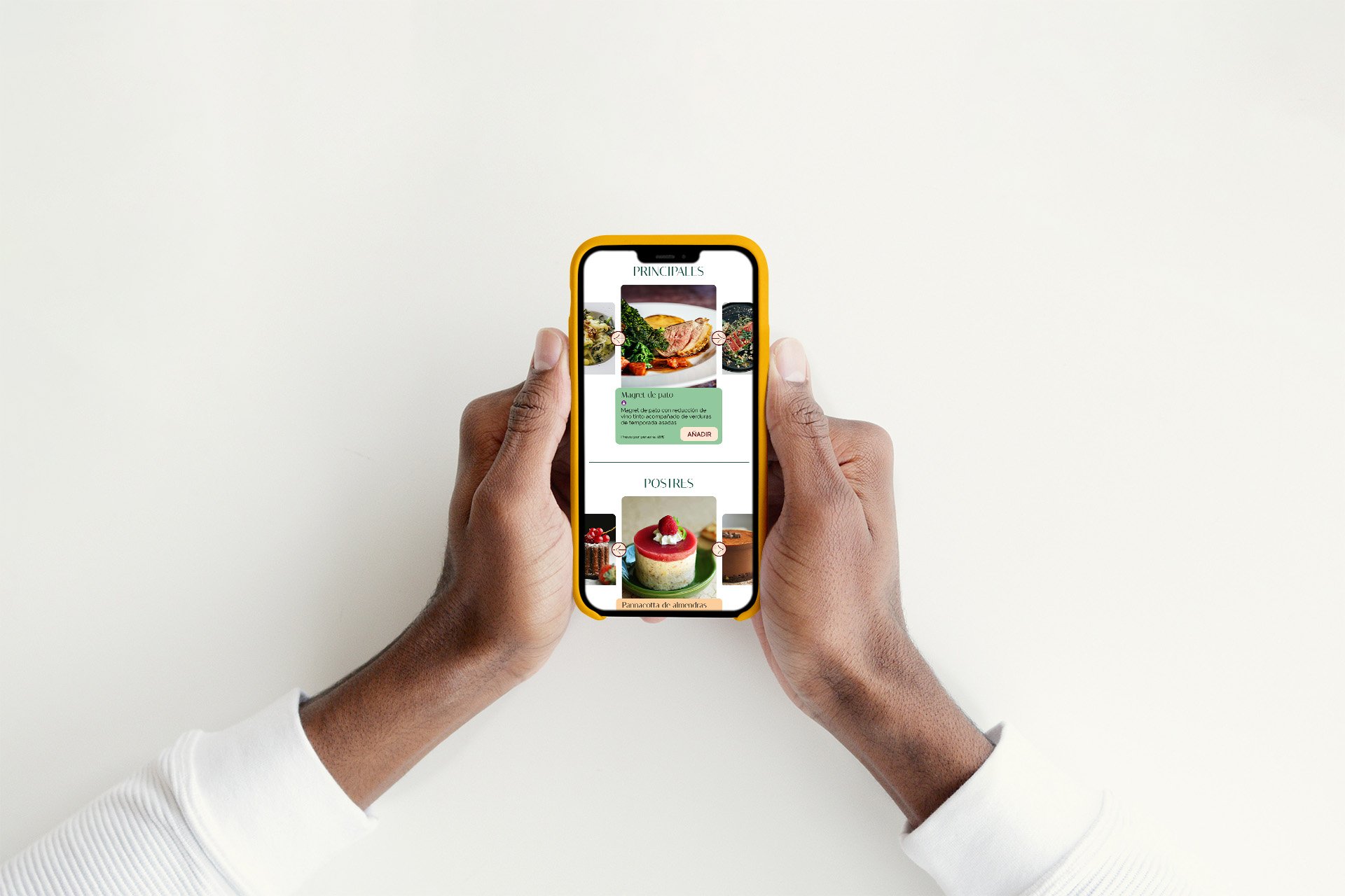
Step 4: Hi-Fi prototype
|
Step 4: Hi-Fi prototype |
User feedback applied, design system in place thanks to our brand guidelines, photos taken... It was -finally!- time to do what I personally enjoy the most: make it pretty and user-friendly! I added the brand colors, typography, photos, texts, personalized icons and interactions to the updated wireframes to create a hi-fi prototype.
The goal was for the owners to see the smartphone version of their website as completed and as close as possible to how it will look once it was developed and functional. Buttons, images and icons with actions that would guide the users to complete their journey, making Sonia and Carlos very happy as well!
The next step was to create its responsive website so their users can access their business from any device they wanted and achieve their goals.

Want to talk?
Be like Sonia and Carlos and get in touch!
hello@anafmartin.com
+34 648 24 58 22


