

Case Study
The Vegan Kitchen

Meet The Vegan Kitchen
|
Meet The Vegan Kitchen |
The Vegan Kitchen was born from the minds of Laura and Pedro, a vegan couple tired to visit the same annoying blog sites searching for vegan recipes. They wanted a website that prioritized the user to create a vibrant vegan community who will share their recipes with other people, using clear instructions, photographs of the process and a step-by-step video tutorial.
Laura and Pedro also wanted to help the users cook more vegan options with ingredients they would have in hand, creating an efficient recipe directory that solved the users problem:
What do I eat today? (We have all been there…)
As a lead UX designer on this project, we conducted a competitive research to identify the following problems that The Vegan Kitchen would try to solve for the online vegan community:
Lack of community spirit
Most competitor sites didn’t seem to involve their users and make them a part of the site’s content, something really important within the vegan community
Lack of video content
Even though most recipe blogs have a few photos of the cooking process, it is difficult to find a website that includes videos when it is one of the most consumed media nowadays
Difficulties to search recipes
Many vegan recipes blogs have very chaotic directories that are difficult to navigate and filter for specific ingredients or cooking methods the user may need to cook a recipe
Unnecessary information
We have all seen how recipe websites prioritize SEO over user-friendly content, having to navigate too much unnecessary information to arrive to the actual recipe and ingredients
Step 1: Brand Design
|
Step 1: Brand Design |

The Vegan Kitchen was meant to be an online business that would live entirely on its website, so its branding had to be user-friendly and apply good UX and UI practices, especially on its visual elements like colors, typography, shapes and photographs.
Laura and Pedro wanted to move away from the typical vegan business where everything is green and healthy. They wanted The Vegan Kitchen to be bold and colorful, a brand that would show their users and community members The Vegan Kitchen was a place to share and have fun around vegan cuisine.
Step 2: Wireframes
|
Step 2: Wireframes |

As The Vegan Kitchen was going to be essentially a directory with some additional functions to enrich the user experience, it was necessary to create a sitemap that connected all the pages. Once we settled on the sitemap, it was time to start designing the wireframes to create the website’s basic structure.
The wireframes were created first to fit a desktop screen that would be turned into a responsive website to fit smaller screens down to a smartphone using Adobe XD as main design software. This wireframes represented the main flow a user would follow once they arrive at The Vegan Kitchen: search recipes easily, follow the recipe’s instructions with a video tutorial and images, save favorite recipes into their account and contribute to the community with their own recipes to be added to the directory.
The problems we wanted to solve with the wireframes turned into a lo-fi prototype were:
1| Allow the user to search and find the recipes they need or want to make
2| Give a comprehensible step-by-step guide on how to cook the recipe
3| Provide a full video tutorial for the users to cook the recipe easily
4| Create a vibrant community to share users’ recipes for everyone
Step 3: Usability study
|
Step 3: Usability study |
To ensure the initial design was going in the right direction for the end user, we conducted a usability study with our wireframes turned into low fidelity -or lo-fi- prototype. With Laura and Pedro’s help, we gathered a diverse group of people to conduct our research.
I used the feedback and insights we collected after gathering and analyzing the data from the observations and interviews we conducted with the study’s participants to update the wireframes, including features and correcting design flaws in order to allow for a better user experience once we had the final design.
Some of those insights were:
Full screen video
One of the most important features of The Vegan Kitchen is video tutorials of each recipe, so some participants pointed out that they would prefer the video to be seen on full screen
Filtered search
Participants were really happy with the filtered search option so they could look for ingredients and recipes quickly
Easy to follow
The participants were able to complete the task easily and without guidance in a timely manner, which was also checked on the post-task interview
Info on homepage
The first homepage was lacking some important information and sections for the participants, such as the advantages to become a member of the community
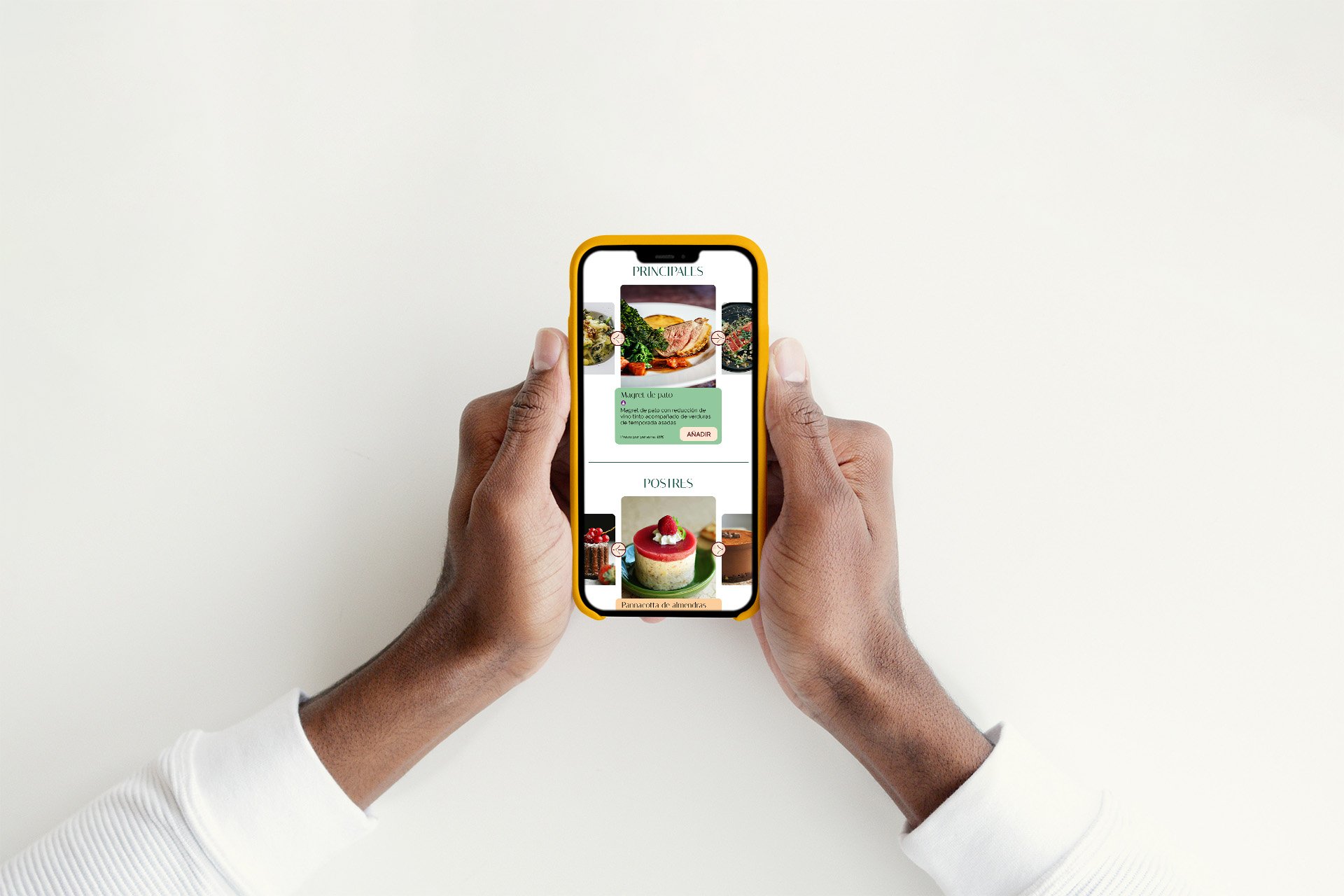
Step 4: Hi-Fi prototype
|
Step 4: Hi-Fi prototype |


After the wireframes were updated with the insights gathered through the usability study, it was time to apply the visual elements we created during The Vegan Kitchen’s brand design.
As I designed its brand to follow UX and UI standards, it was really satisfying to see the website come to live full of color and vibrant components that interacted together perfectly! Creating High Fidelity prototypes and mockups its definitely my favorite part of the design process :)
Once all the pages were designed to be responsive for all screen sizes, it was time to send them to the developers to turn it into a real product for users to enjoy and experience.
Want to talk?
Get the responsive website of your dreams with my help!
hello@anafmartin.com
+34 648 24 58 22